제품을 만들고, 스프린트를 거듭하다보면,
동일한 컴포넌트지만,
다른 태그를 사용하고 싶을때,
다른 스타일을 사용하고 싶을때,
다른 속성을 사용하고 싶을때,
이런 경우들이 발생한다.
스프린트를 거듭할 수록 미리 확장성을 고려해서 짜야겠다는 깨달음을 얻게된다.
아래 이미지는 실제 우리 제품의 사례이다.
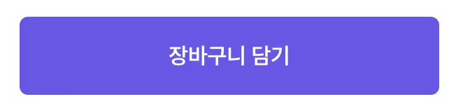

위와 같이 다양한 variation을 가지 버튼이 존재 한다.
장바구니 버튼을 클릭시 addToCart와 관련된 액션이 실행된다.
로그인 버튼을 클릭시 로그인페이지로 이동한다.
—> 시맨틱 태그를 고려한다면, 장바구니 버튼은 button태그이고, 로그인 버튼은 a태그여야한다.
하지만 같은 버튼 ui를 가지고 있다.
어떻게 하면 똑똑하게 시맨트 ui를 처리할 수 있을까
기존 코드는 아래와 같이 작성하였다.
const FilledButton = styled(Button)<FillButtonProps>`
	display: flex;
	align-items: center;
	justify-content: center;
	height: auto;
	padding: 9px 16px;

	border-radius: 6px;
	font-weight: 600;
	letter-spacing: -0.14px;

	&.ant-btn-text:disabled {
		background-color: ${(props) => props.theme.new.colors.sol_gray_100} !important;
		color: ${(props) => props.theme.new.colors.sol_gray_300} !important;
	}

	&${(props) => (props.variant === ButtonVariants.solid ? '.ant-btn-text' : '.unavailable')} {
		color: ${(props) => props.theme.new.colors.white};

		&.active,
		&:hover {
			background-color: ${(props) => props.theme.new.colors.sol_indigo_600};
			color: ${(props) => props.theme.new.colors.white};
		}
	}
	&${(props) => (props.variant === ButtonVariants.soft ? '.ant-btn-text' : '.unavailable')} {
		background-color: ${(props) => props.theme.new.colors.sol_indigo_100};
		color: ${(props) => props.theme.new.colors.sol_indigo_600};

		&.active,
		&:hover {
			background-color: ${(props) => props.theme.new.colors.sol_indigo_200};
			color: ${(props) => props.theme.new.colors.sol_indigo_600};
		}
	}
	&${(props) => (props.variant === ButtonVariants.outlined ? '.ant-btn-text' : '.unavailable')} {
		color: ${(props) => props.theme.new.colors.sol_indigo_500};
		border: 1px solid ${(props) => props.theme.new.colors.sol_indigo_500};
		&.active,
		&:hover {
			background-color: ${(props) => props.theme.new.colors.sol_indigo_50};
			color: ${(props) => props.theme.new.colors.sol_indigo_500};
		}
	}
`

export default FilledButton

const FilledLink = styled(Link)<FillLinkProps>`
	display: flex;
	align-items: center;
	justify-content: center;
	height: auto;
	padding: 9px 16px;

	border-radius: 6px;
	font-weight: 600;
	letter-spacing: -0.14px;

	&.disabled {
		background-color: ${(props) => props.theme.new.colors.sol_gray_100} !important;
		color: ${(props) => props.theme.new.colors.sol_gray_300} !important;
	}

	${(props) =>
		props.variant === LinkVariants.solid &&
		css`
			background-color: ${(props) => props.theme.new.colors.sol_indigo_500};
			color: ${(props) => props.theme.new.colors.white};

			&.active,
			&:hover {
				background-color: ${(props) => props.theme.new.colors.sol_indigo_600};
				color: ${(props) => props.theme.new.colors.white};
			}
		`}
	${(props) =>
		props.variant === LinkVariants.soft &&
		css`
			background-color: ${(props) => props.theme.new.colors.sol_indigo_100};
			color: ${(props) => props.theme.new.colors.sol_indigo_600};

			&.active,
			&:hover {
				background-color: ${(props) => props.theme.new.colors.sol_indigo_200};
				color: ${(props) => props.theme.new.colors.sol_indigo_600};
			}
		`}

  ${(props) =>
		props.variant === LinkVariants.outlined &&
		css`
			color: ${(props) => props.theme.new.colors.sol_indigo_500};
			border: 1px solid ${(props) => props.theme.new.colors.sol_indigo_500};

			&.active,
			&:hover {
				background-color: ${(props) => props.theme.new.colors.sol_indigo_50};
				color: ${(props) => props.theme.new.colors.sol_indigo_500};
			}
		`}
`

export default FilledLink
filledLink와 filledButton으로 각각의 컴포넌트를 생성하여 사용하였다.
- 이렇게 사용할 경우, 아래와 같은 단점이 발생한다.
- 동일한 ui이기 때문에, 주로 FilledLink보다는 FilledButton이 사용되거나, FilledButton의 a태그를 감싸서 사용하기도 하였다.
- 같은 스타일이 두곳에 생성되기 때문에, 스타일이 변경될 경우, 대응이 어려움.
Polymorphic한 ui 컴포넌트
요약하자면,
- 다양한 semantic 태그
- 다양한 속성
- 다양한 스타일 을 가질 수 있는 컴포넌트 이다.
→ 컴포넌트가 어떤 element도 될 수 있고, 어떤 attribute도 사용할 수 있다.
예 ) Mui에서 자주 볼 수 있는 패턴인데, mui의 button 컴포넌트를 참고해보자.
//mui의 button 컴포넌트
<Button
	variant="outlined"
	size="small"
	label={slots.libraryReviewButton.text}
	endIcon={<ArrowRight1_5px />}
	href={slots.libraryReviewButton.link} // href를 추가하게 되면, a태그로 변경된다.
	target="_blank"
	onClick={handleClickPromotionButton}
/>
어떤 방식으로 작동 하는 것일까.
export const Button = ({ as, ...props }) => {
	const Element = as || "button";
	return <Element style={{ backgroundColor: "red" }} {...props} />;
};
→ element자체를 props로 주입시켜주는 방식이다.
기존에 사용하면 FilledButton에 방식을 적용해보자
type ViewProps<T extends React.ElementType> = {
  as?: T;
} & React.ComponentPropsWithoutRef<T>;

type ViewComponent = <C extends React.ElementType = "div">(
  props: ViewProps<C> & {
    ref?: React.ComponentPropsWithRef<C>["ref"];
  }
) => React.ReactElement | null;
//가장 공통으로 사용할 수 있는 view를 만들어주고,
export const View: ViewComponent = forwardRef(
  <T extends React.ElementType = "div">(
    { as, ...props }: ViewProps<T>,
    ref: React.ComponentPropsWithRef<T>["ref"]
  ) => {
    const Element = as || "div";
    return <Element ref={ref} {...props} />;
  }
);
//View에 button 컴포넌트를 default로 주게되면, polymorphic한 컴포넌트가 완성된다.
//만약 여기에 스타일을 추가해주고 싶다면, 스타일이 적용된 view를 사용하거나, button에 styled줄 수 있다.
export const FilledButton = ({ as, ...props }) => {
  return (
    // 위에서 생성한 View 컴포넌트를 이용.
    <View as={as || 'button'}
      {...props}
    />
  );
}

//혹은 FilledButton 내부에서 직접 as 를 사용하는 방법도 있다.
// 하지만, 지속적으로 해당패턴을 사용한다면, view라는 모듈로 분리하여 사용하는게 유지보수성 측면에서 좋다고 생각한다.
interface FilledButtonProps<T extends React.ElementType> {
	as?: T
	[key: string]: any
}
export const FilledButton = <T extends React.ElementType = 'button'>({ as, ...props }: FilledButtonProps<T>) => {
	const Element = as || Button //mui button
	return <Element {...props} />
}
- FilledButton에 적용해보면서 마주한 문제점
- mui등 다른 ui library와 함께 사용할 경우 타입 추론이 어려움.
- props를 제대로 지정해주지 않았을 경우, children이 제대로 렌더되지 않는 이슈 발생.
- type의 지정이 관건인듯 하다. 어떤 children이 들어와도, 문제없이 props를 받을 수 있어야 한다.
- 그외 단점
- as의 사용의 모호함.
- 단점을 보완할 수 있는 패턴으로 render delegation 패턴이 있음.
- https://kciter.so/posts/render-delegation-react-component/
결국 이 패턴을 사용함에 있어서 가장큰 장벽은 타입이었다. 타입설정에 따라, children이 반환되지 않기도 하였다. 타입 설정 방식에 대한 내용은 Composition - Material UI https://blog.logrocket.com/build-strongly-typed-polymorphic-components-react-typescript/ 요 페이지에 자세히 나와있다.
참고자료